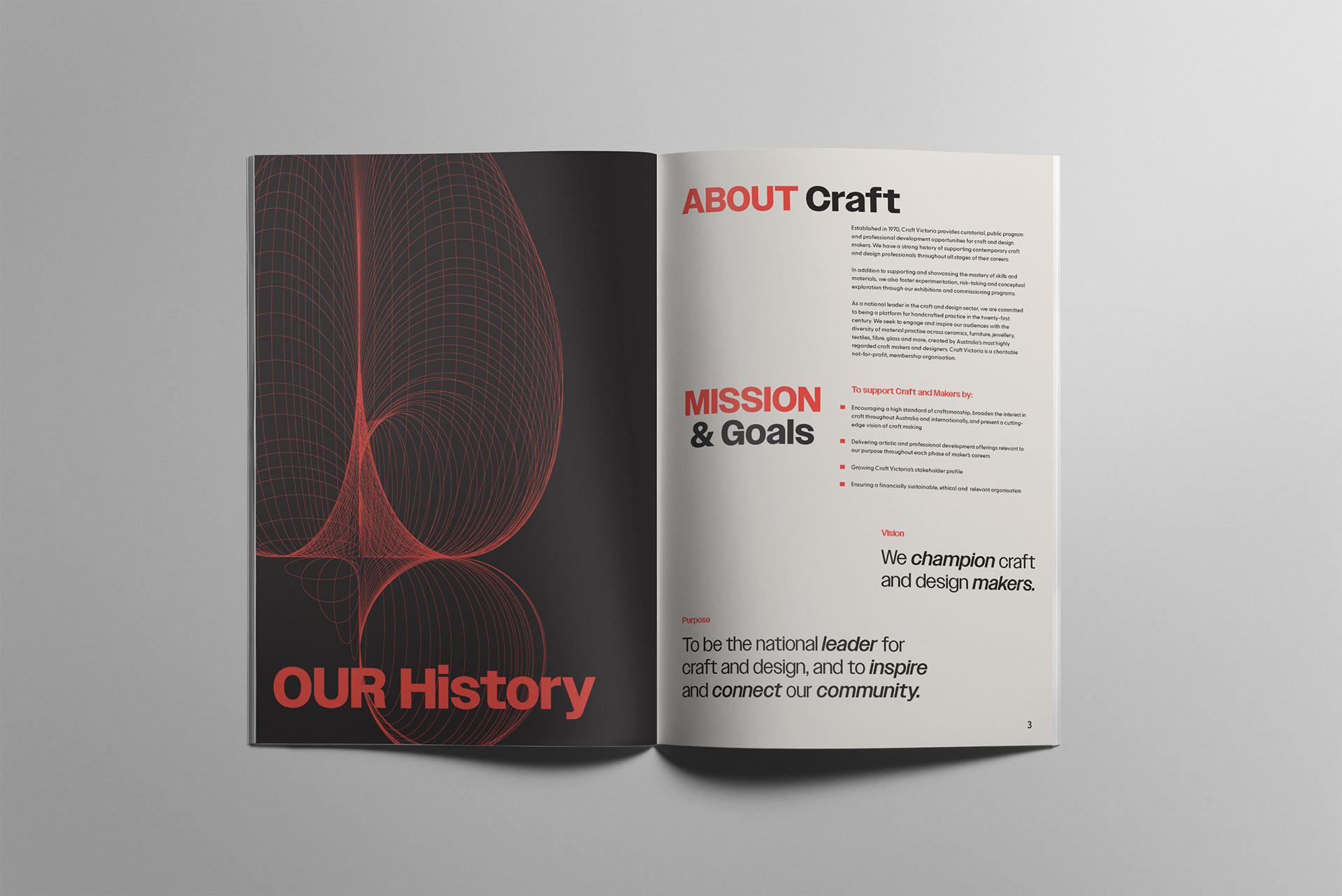
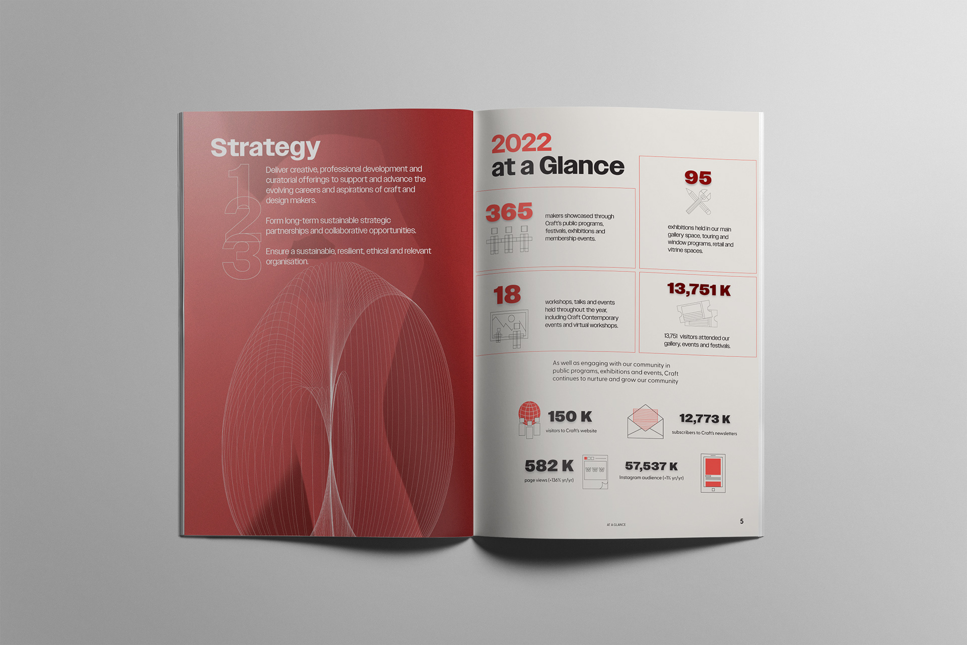
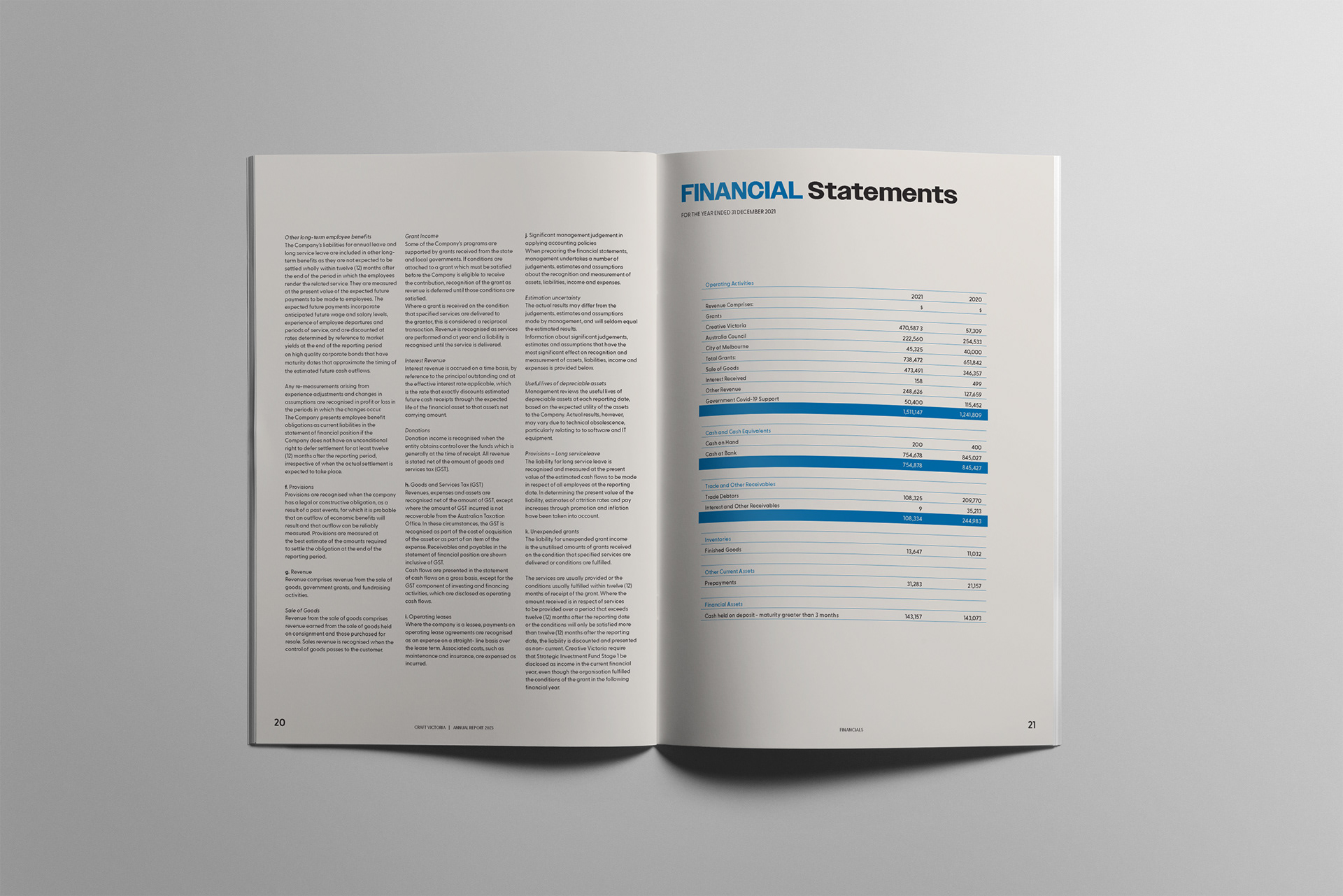
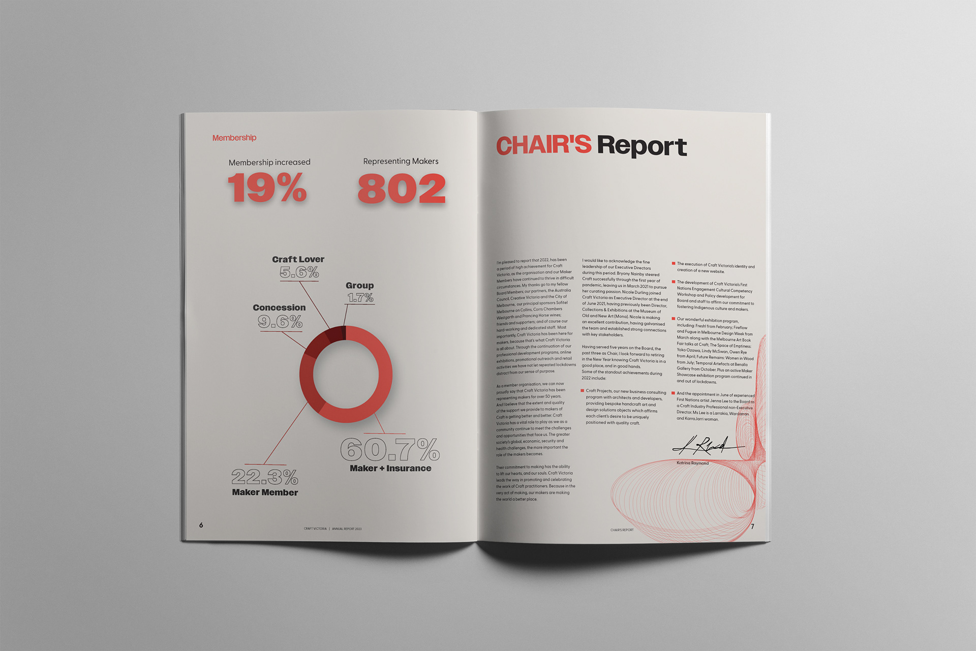
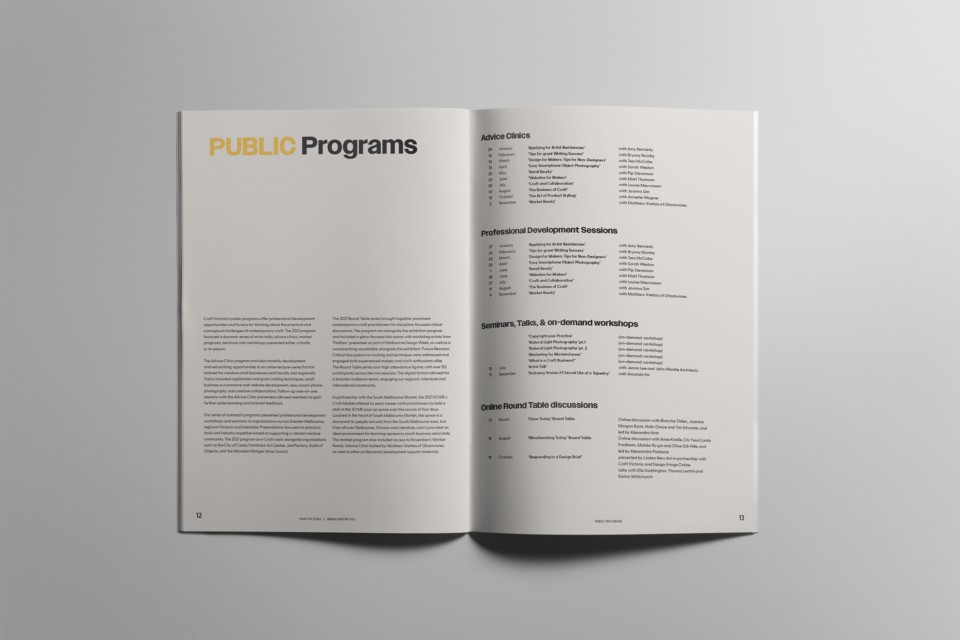
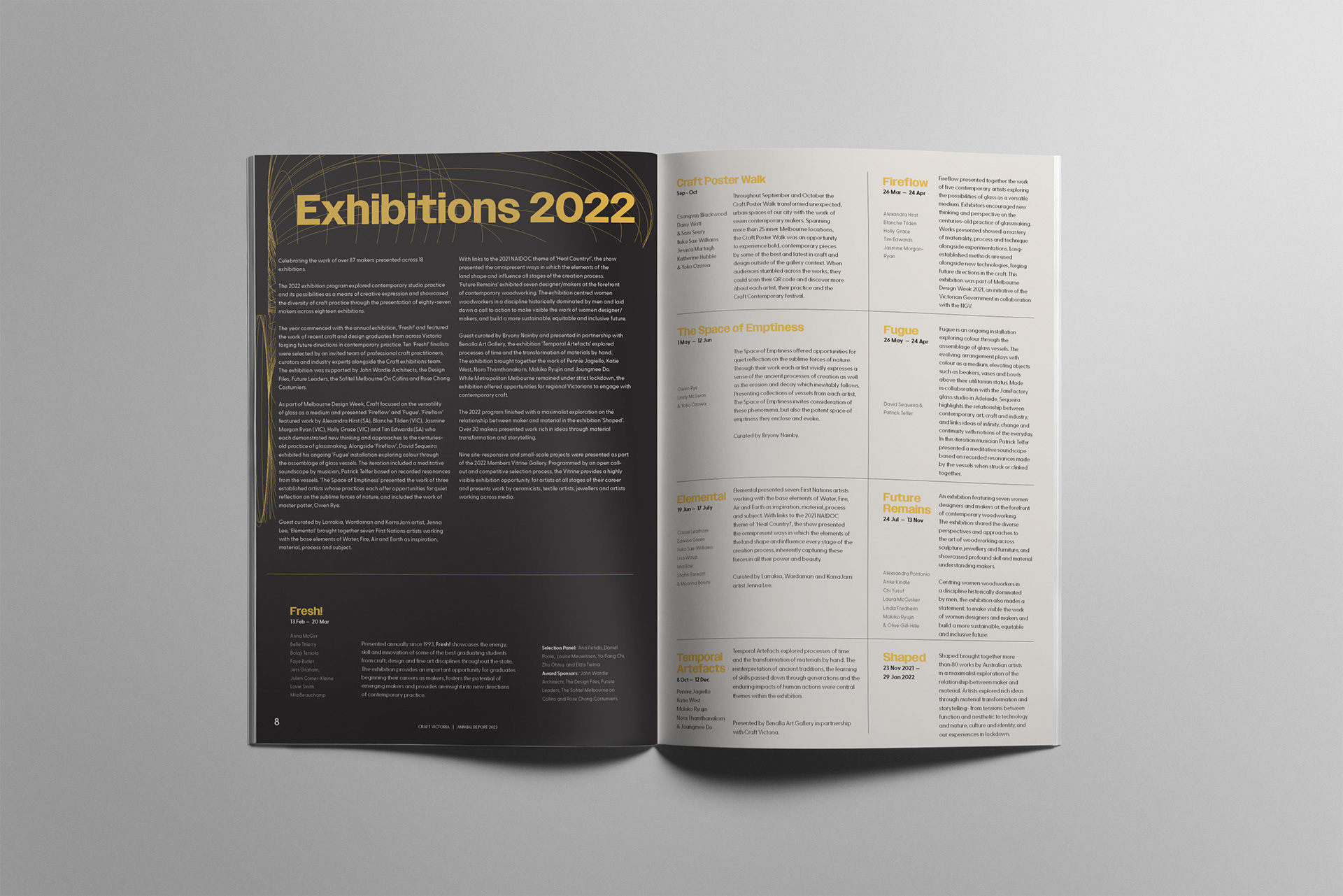
The concept behind this annual report design was to highlight the early stages of the creative process, emphasizing structured elements such as wireframing and diagrams. The color scheme — red, yellow, and blue — was intentionally chosen to represent different stages of craftsmanship:
Red symbolizes the trial-and-error phase, reflecting both the challenges and strong emotions, including frustration, that can arise during the initial design process. Yellow represents steady development and a sense of calm and clarity during the refinement stage. Blue signifies confidence in the final outcome, marking the completion of the creative journey. By integrating these visual elements, the design aimed to convey the structured yet evolving nature of the creative process.
